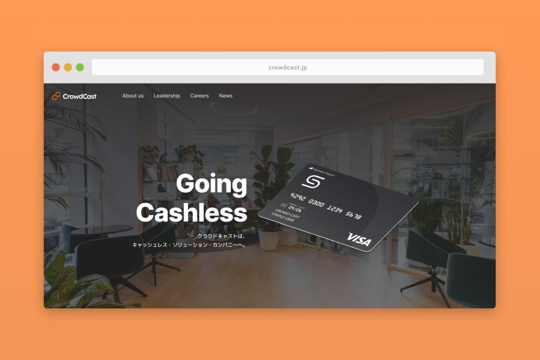
Renewing the corporate brand for a cashless future
Discipline:Branding
Medium:Website
Tools:Figma, Webflow

Crowd Cast develops financial solutions for small-to-medium enterprises and aims to bring their internal accounting infrastructure paperless and up-to-date with the modern age in Japan.


Logo and website before redesign
Rebuilding the logo and visual assets
When I joined this early-stage startup, the company had minimal design direction and very few existing visual assets. As the business grew, there was a clear need for a more stable, scalable visual identity. Recognising this, I took the initiative to develop an updated brand image and a comprehensive set of visual assets that could evolve with the company’s needs.
I started with the original logo as a foundation and rebuilt it using a geometric grid system to enhance consistency and legibility across various sizes and applications. The refined logo retains the spirit of the original design but is more adaptable for both digital and print media. The brand mark itself was inspired by the concept of unity, aligning with the company's motto: "Power to the Crowds". By softening sharp angles and refining the asymmetrical shape, I improved the logo’s visual impact, making it both modern and more representative of the company’s core values.


Renewal of visual assets and documentation
Refreshing the website
The corporate website needed a refresh to better reflect the company’s growing professionalism and its personable, people-first culture. I wanted the website to not only communicate the company’s story but also build trust with visitors, whether they were potential clients, partners, or employees.
I began by researching competitors and similar companies in the industry to understand best practices and how to position the company uniquely within its market. The landing page was designed to place both the products and the people at the forefront, showcasing the team’s passion and expertise. By integrating more engaging imagery, clear messaging, and user-centered navigation, I aimed to make the site both visually appealing and intuitive to navigate, while also ensuring it conveyed the company’s mission and values effectively.
